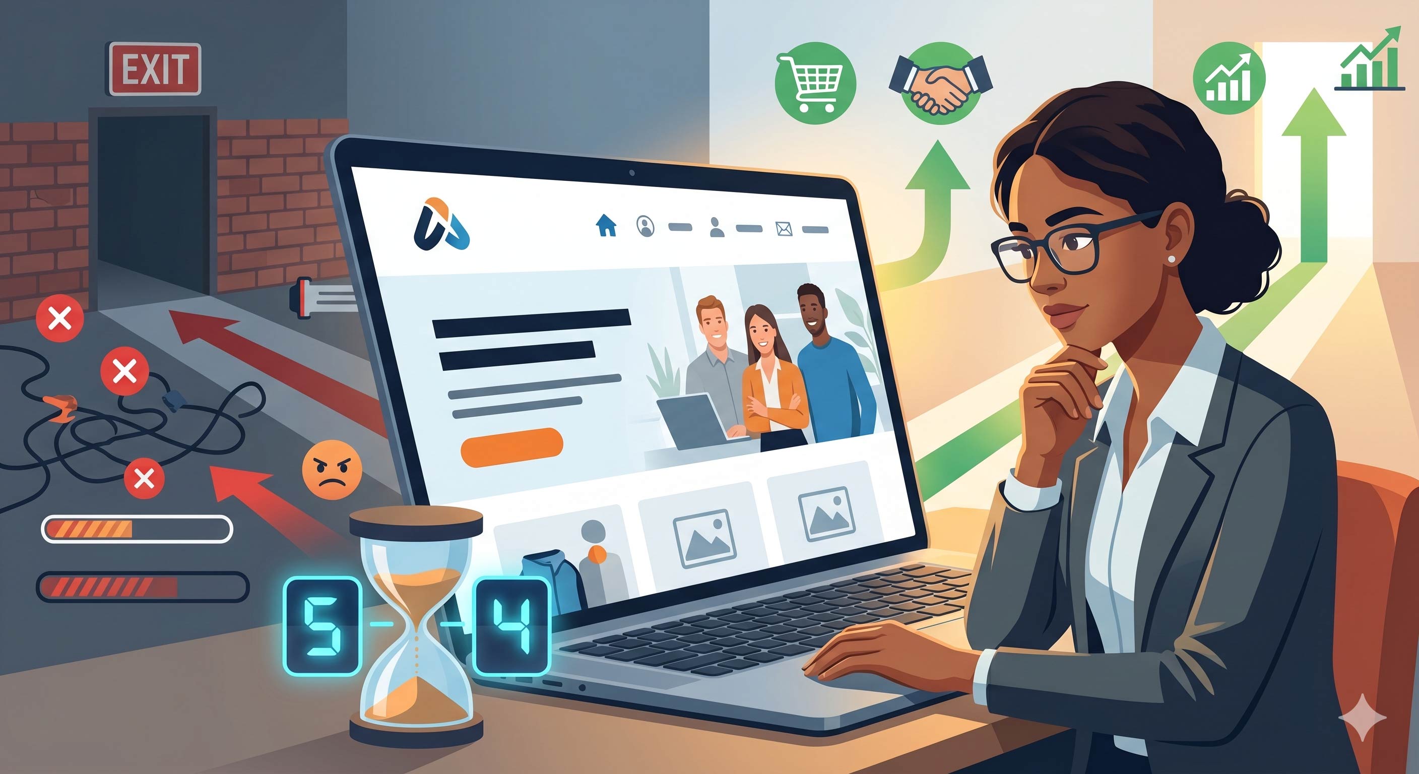
What Customers Notice in the First 5 Seconds of Your Website

Discover what customers notice in the first 5 seconds of visiting your website and how optimizing speed, design, and CTAs can boost conversions.
The 5-Second Rule: Why First Impressions Are Everything Online
You only get one chance to make a first impression. In the digital world, that window is exceptionally tight. Studies show that it takes just 0.05 seconds for users to form an opinion about your website, and within the first 5 seconds, they decide whether to stay or leave. If your site fails to captivate them immediately, you are likely suffering from high bounce rates and lost revenue.
Understanding what customers notice in these crucial first seconds is the key to converting casual visitors into paying clients. When a user lands on your page, their brain is rapidly processing visual cues, layouts, and performance. In this guide, we break down the critical elements that make or break your website's first impression and how you can optimize them for maximum impact.
1. Page Speed: The Silent Dealbreaker
Before a user can even admire your design, your website has to load. If your page takes more than two or three seconds to load, most visitors will click the back button. In modern web design, website speed is a massive SEO superpower that directly impacts both search rankings and user satisfaction.
A slow-loading website signals unprofessionalism. To ensure your site loads instantly, optimize your images, leverage browser caching, and use clean, efficient code. Every millisecond saved keeps a potential customer engaged longer, giving your brand a chance to make its pitch.
2. The Hero Section: Your Digital Elevator Pitch
Once the page loads, the hero section—the area above the fold—is the absolute center of attention. This is your digital elevator pitch. Within seconds, a user must find answers to three essential questions:
- What do you offer? (A clear, bold headline)
- How does it solve my problem? (A supportive subheadline)
- What should I do next? (An obvious call-to-action)
If your hero section is cluttered, confusing, or lacks a clear message, it is one of the major signs your website is secretly killing sales. Keep your value proposition simple, punchy, and highly visible.
3. Color Psychology: Setting the Visual Tone
Before reading a single word of text, users subconsciously register your website's color palette. Colors evoke immediate emotional responses. For instance, blue conveys trust and security, red creates urgency, and green suggests growth and health.
Aligning your brand colors with the psychology of trust in modern web design helps build immediate credibility. Use a clean, balanced color scheme with plenty of white space. A high-contrast layout ensures that the most important information stands out, guiding the user's eye naturally down the page.
4. Clear Call-to-Action (CTA) Buttons: Directing the Path
What do you want your visitors to do? Whether it is scheduling a call, buying a product, or downloading a guide, your Call-to-Action (CTA) must be impossible to miss. In the first 5 seconds, a user should instantly spot where to click next.
Your primary CTA button should feature a contrasting color that pops from the background. Use action-oriented, persuasive text like "Get Started Today" or "Claim Your Free Consultation." Implementing strategically placed CTAs is one of the top smart lead generation strategies to capture high-quality leads before they bounce.
5. Trust Elements: Proving Your Legitimacy
With cyber threats and online scams on the rise, today's consumers are naturally skeptical. During their initial five-second scan, they look for visual trust signals that confirm your business is legitimate and secure. These elements include:
- SSL secure badges (the padlock icon in the browser bar)
- Recognizable client logos or partner badges
- Star ratings from platforms like Google or Trustpilot
- A professional, clean layout free of intrusive pop-ups
Displaying these trust indicators prominently above the fold assures visitors that they are in safe hands, instantly reducing their friction to engage with your brand.
Conclusion: Master the First 5 Seconds
Your website is your hardest-working salesperson, but it only has 5 seconds to win over a new visitor. By prioritizing fast load times, a clear hero section, strategic color psychology, unmistakable CTAs, and prominent trust elements, you can transform your site into a high-converting asset.
Transform Your Website with Jikut
Don't let a poor first impression cost you valuable leads and sales. At Jikut, we specialize in building fast, beautiful, and highly optimized websites that captivate users from the very first second. Let our team of design and development experts help you create an online presence that builds trust and drives growth.
Get in touch with us today:
Phone: +91 8888 589767
Email: sales@jikut.com
Written by
Vikas Giri
Founder & Content Creator
Frequently Asked Questions
+−Why is the first 5 seconds of a website visit so critical?
+−What is the most important element of a hero section?
+−How does page speed affect user behavior?
+−How do colors influence website visitors?
+−What are some trust elements I can add to my homepage?
+−How often should I update my website's design?
Comments
Loading comments...