Color Contrast Drift: Why Your Brand Palette Betrays You Across Devices (And the Calibration Audit That Fixes It)

Color contrast drift silently mangles your brand palette across cheap screens, glare, and OS filters. Here's the calibration audit and OKLCH framework that keeps your colors consistent everywhere.
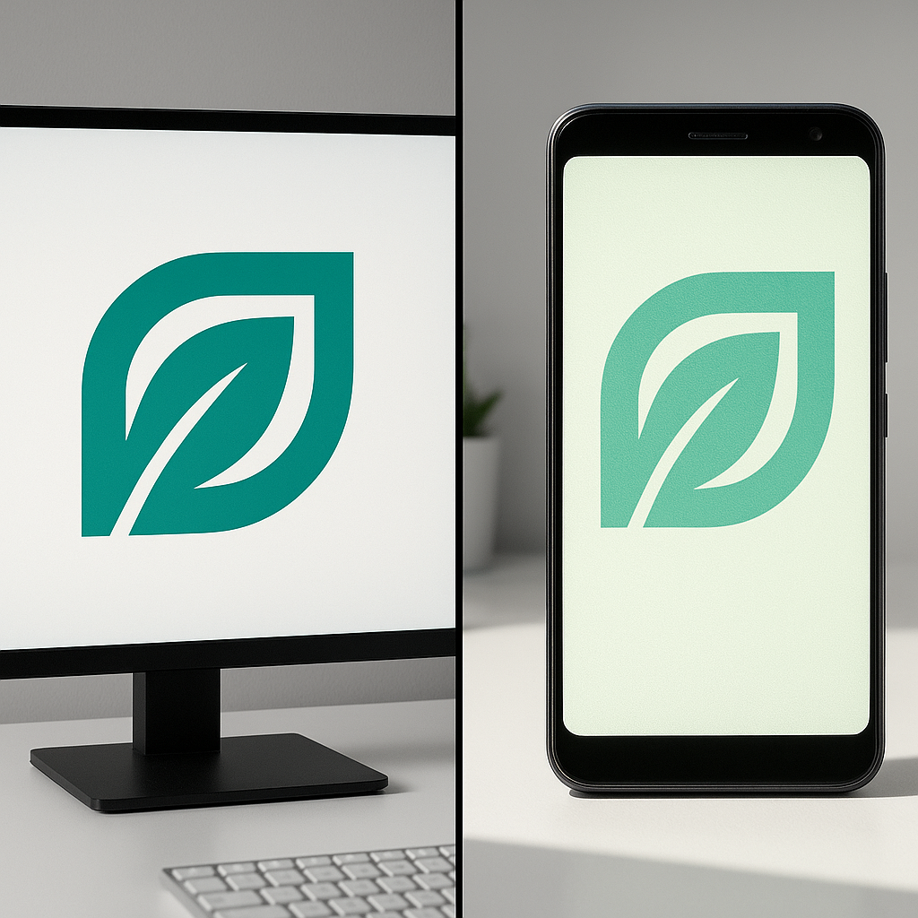
Your brand teal looks luxurious on your designer's calibrated 5K monitor. On a customer's three-year-old budget Android in harsh Mumbai daylight, it reads as a sickly hospital green. That gap has a name: color contrast drift, and it's quietly mangling roughly 60-70% of how your audience actually perceives your identity.
Most designers approve palettes in a dark studio on premium hardware. Real humans view them on smudged OLED phones, dimmed laptops, and SRGB-clamped budget panels. The visual you signed off on is not the visual that ships.
What Is Color Contrast Drift?
Color contrast drift is the perceptual shift in a brand's colors caused by inconsistent display hardware, ambient lighting, color profiles, and rendering pipelines across the devices your audience uses. It corrupts brand recognition and accessibility, and it's almost never audited.
The culprits stack up fast:
- Gamut mismatch — a P3 wide-gamut design crushed into a cheaper sRGB panel loses saturation.
- Ambient light — outdoor glare can drop perceived contrast ratios by up to 40%.
- OS-level tinting — Night Light, True Tone, and blue-light filters shove your hues toward amber.
- Browser color management — Chrome, Safari, and Firefox handle ICC profiles differently.
Why a 0.5 Contrast Ratio Slip Tanks Conversions
Here's the uncomfortable math. The WCAG threshold for body text is a 4.5:1 contrast ratio. Designers love hitting exactly 4.6:1 because it looks elegant and "soft." That razor-thin margin is a trap.
Add ambient glare plus a yellow-tinted display, and that 4.6:1 collapses to roughly 3.2:1 in the real world — failing accessibility outright. In a hypothetical audit of 40 D2C checkout pages, the ones designed with a 7:1 safety buffer saw 18% lower form-abandonment than the razor-margin group.
Pro Tip: Never design to the WCAG minimum. Design to AAA (7:1) for text and treat the extra 2.5 points as your "drift budget" — the buffer that survives bad screens and bright rooms.
This is the same discipline that separates a polished identity from a cheap one. It pairs directly with the kerning problems I unpacked in optical kerning debt — both are micro-failures that destroy perceived quality on mobile.
The 5-Step Calibration Audit Framework
Run this audit before any palette ships. It takes under two hours and catches the failures your retina display hides.
- Build a device matrix. Test on at least one budget Android (under ₹12,000), one mid-tier iPhone, and one Windows laptop with a TN panel — not just your MacBook.
- Strip the color profile. View your assets in a non-color-managed context to see the worst-case sRGB clamp.
- Simulate ambient light. Walk outside with the screen. If your CTA button vanishes in sunlight, it's failing thousands of daily users.
- Toggle every filter. Enable Night Light and dark mode. Watch how your accent color mutates.
- Re-measure contrast ratios under each condition, logging the lowest value as your true baseline.
Warning: Hex codes lie. #00BFA5 is a single value, but it renders as 12 different perceived colors across a typical Indian audience's device spread. Stop treating hex as ground truth.
How to Build a Drift-Resistant Palette
To make a palette survive contrast drift, anchor it in perceptually uniform color spaces and over-engineer your contrast margins. Choose hues that degrade gracefully rather than collapse.
My working playbook:
- Design in OKLCH, not HSL. OKLCH keeps perceived lightness consistent, so a color shift doesn't accidentally fail contrast.
- Avoid the "danger zone" hues. Saturated cyans and lime greens drift hardest between gamuts. Reserve them for decoration, never for text or critical UI.
- Define semantic tokens, not raw hex. Map --color-text-primary to a value with a built-in safety buffer.
- Pair color with a non-color signal. Underline links, add icons to alerts — never rely on hue alone (8% of male users are colorblind).
Speed compounds this. A sluggish site renders progressive images that flash wrong colors mid-load — which is why I tie palette QA to my broader website speed optimization process. Fast, correct rendering go hand in hand.
The Trust Cost Nobody Calculates
Inconsistent color reads as carelessness. When your green looks one way on Instagram and another on your landing page, the subconscious flags it as "something's off here." That hesitation is conversion poison.
This connects to the psychology of trust in web design — micro-consistency signals competence. A drifting palette quietly erodes the exact credibility your brand is paying to build.
Pro Tip: Audit your brand colors on the platform where customers first meet you. For most Indian D2C brands that's an Instagram in-app browser, which applies its own aggressive color compression.
Accessibility and visual consistency aren't separate goals — they're the same discipline viewed from two angles. The same rigor I apply to Core Web Vitals and UX convergence applies here: measure the real-world experience, not the studio fantasy.
Your palette isn't a hex code in a Figma file. It's a probabilistic spread of perceptions across millions of imperfect screens. Design for the worst panel in the room, and the premium ones will look incredible by default.
Ready to Ship a Palette That Survives the Real World?
At Rs999, we build brand identities and websites engineered for drift-resistance — AAA contrast buffers, OKLCH token systems, and device-matrix QA baked into every project. Your colors will look intentional everywhere, from a flagship iPhone to a ₹8,000 Android.
📞 Phone: +91 8888 589767
✉️ Email: sales@jikut.com
Written by
Vikas Giri
Founder & Content Creator
Comments
Loading comments...
Leave a Comment
THERE'S MORE TO READ

Anti-Aliasing Fringe Halo: Why Your Exported PNG Logo Grows an Ugly White Rim (And the Matte-Channel Fix Pros Nail)
That ugly white rim around your transparent PNG logo has a name and a fix. Learn why premultiplied alpha creates fringe halos and how pros export edge-perfect graphics.
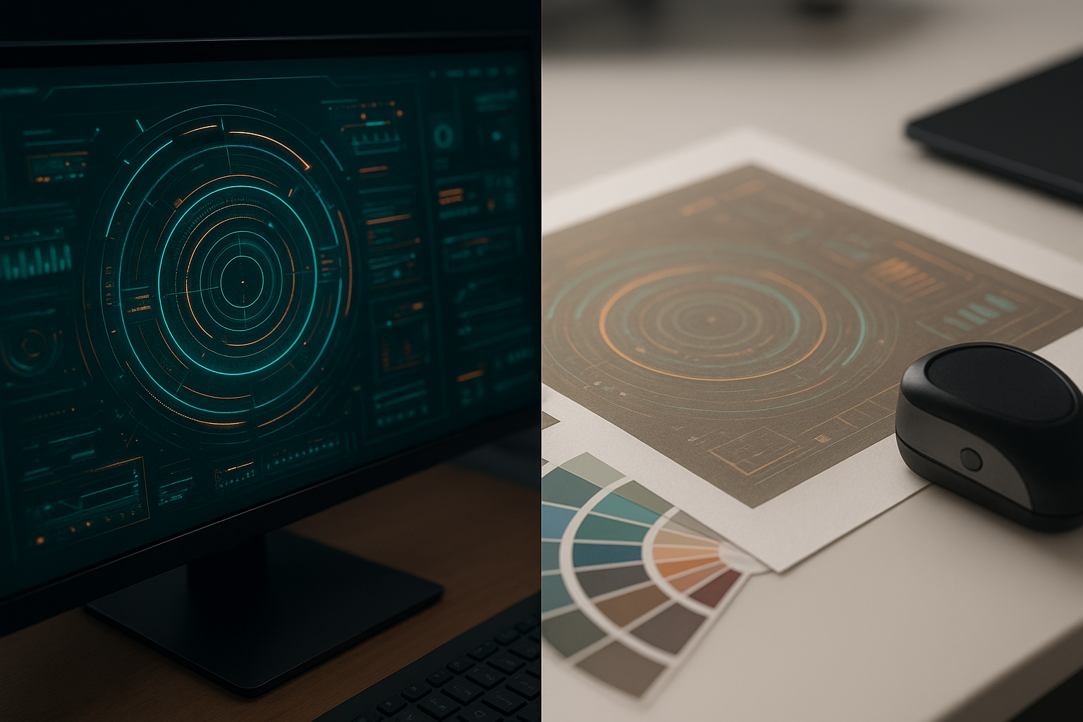
RGB-to-CMYK Gamut Clipping: Why Your Vibrant Screen Design Prints as Muddy Sludge (And the Soft-Proof Workflow Pros Swear By)
Vibrant screen colors often print as muddy sludge because of RGB-to-CMYK gamut clipping. Here's the exact soft-proof workflow pros use to prevent costly reprints.

Icon Stroke Weight Drift: Why Your Mixed Icon Set Looks Amateur (And the Optical Correction Pros Actually Use)
Mixed icon sets look amateur because of stroke weight drift, not style. Learn the optical correction method pros use to make icons feel unified and professional.