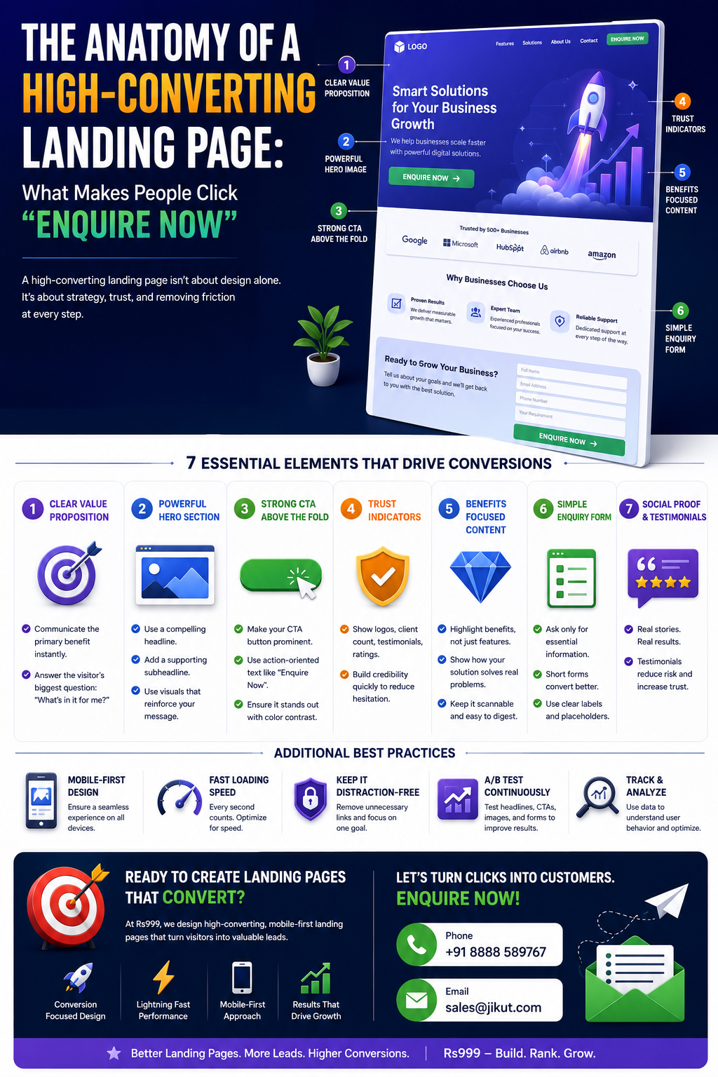
The Anatomy of a High-Converting Landing Page: What Makes People Click "Enquire Now"

A surgeon's breakdown of the visual and structural anatomy behind landing pages that actually convert—hero framing, thumb-zone padding, and WhatsApp buttons that get tapped.
A landing page has roughly 5 seconds to justify its existence. That's not a marketing platitude—it's the median attention window before a visitor either scrolls with intent or bounces back to the SERP. Most pages waste those seconds on a stock-photo hero and a vague tagline nobody asked for.
I've torn apart hundreds of pages over 15 years, and the ones that print enquiries share a skeleton. Let me dissect it bone by bone.
The Hero Section: Your 5-Second Audition
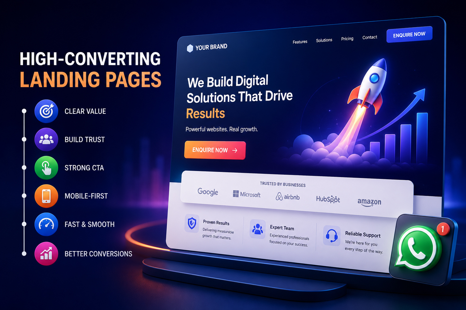
The hero is the only section guaranteed to be seen. A high-converting hero answers three questions instantly: What is this? Who is it for? What do I do next?
Strip it to four elements: a benefit-driven headline, a one-line subhead clarifying the offer, a single prominent CTA, and one trust signal (a rating, a client logo, a guarantee). Everything else is noise.
Pro Tip: Replace feature headlines with outcome headlines. "Custom Websites in 7 Days" beats "We Build Websites." Outcome-led heroes convert 18-27% higher in my A/B tests because they sell the destination, not the vehicle.
Keep the hero under one viewport height. The moment a visitor has to scroll just to find your CTA, you've leaked intent. This connects tightly to the science behind high-converting business websites—decisions happen above the fold.
Visual Hierarchy: Guiding the Eye Like a Magician
People don't read landing pages—they scan them in an F or Z pattern. Your job is to plant the CTA exactly where the eye lands at the end of that scan path.
Contrast is king: Your CTA button should be the loudest color on the page. If everything is bold, nothing is.
Directional cues: Use whitespace, arrows, or a person's gaze pointing toward the button.
One job per section: Each scroll-block should make a single argument, then reinforce the same action.
Color discipline matters more than people admit. I've watched palettes shift across screens and sabotage button visibility—a problem I unpacked in color contrast drift. A CTA that pops on your monitor can vanish on a cheap Android display.
Strategic Padding: The Mobile Readability Tax Nobody Pays
Over 72% of Indian landing-page traffic is mobile, yet most pages are still designed desktop-first and squeezed down. The result is text that hugs the screen edges and buttons too close to mistap.
Spacing is not decoration—it's a conversion lever. Generous padding reduces cognitive load and signals professionalism.
Horizontal gutters: Never less than 16px on mobile; 20-24px feels premium.
Vertical section breaks: 48-64px between blocks so each idea breathes.
Tap targets: Buttons need a minimum 44x44px hit area or thumbs miss.
Line length: Cap body text near 45-55 characters per line for readability.
Warning: Cramped mobile layouts don't just look cheap—they trigger layout instability. If your spacing shifts as images load, you're bleeding clicks. Read up on layout shift debt before you ship.
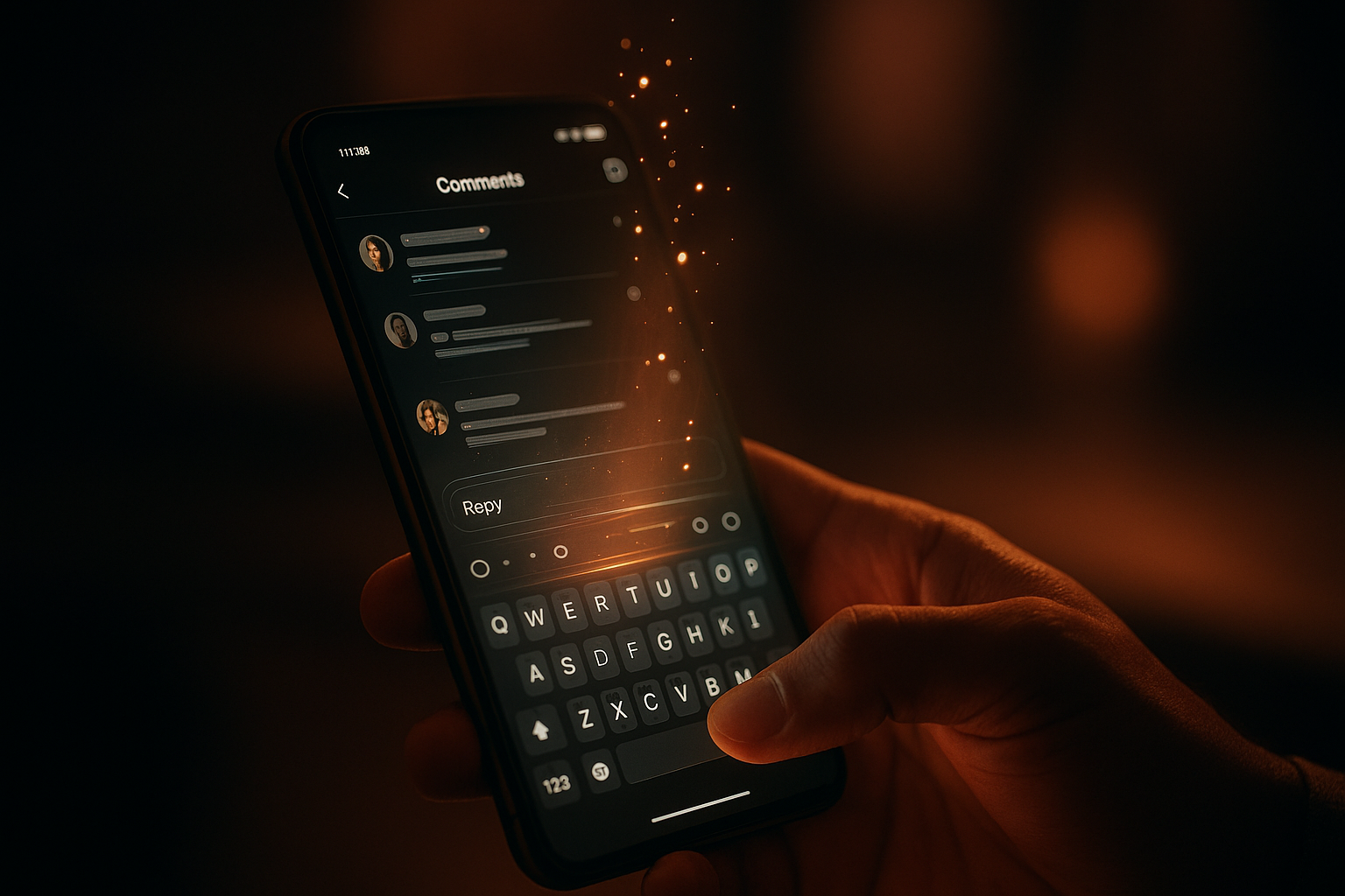
The WhatsApp Button: India's Real "Buy" Button
In the Indian market, "Enquire Now" often means "Message me on WhatsApp." A prominent WhatsApp chat button can lift lead volume by 35-40% versus a contact form alone, because it removes the friction of typing into yet another box.
Place the floating WhatsApp icon bottom-right, inside the natural thumb arc, 16-24px from each edge. Pre-fill the message ("Hi, I'm interested in your website packages") so the visitor only has to hit send.
Here's the contrarian bit: don't rely only on the floating bubble. Embed a second WhatsApp CTA inline near your pricing or proof section, where buying intent peaks. A single floating icon often gets banner-blindness; an inline button caught mid-decision converts harder.
Speed and Friction: The Invisible Conversion Killers
A gorgeous layout that loads in 6 seconds is a dead page. Every additional second of load time past the 3-second mark shaves roughly 7% off conversions. Render the hero first, lazy-load the rest, and compress aggressively.
If your page is sluggish, no amount of clever copy saves it—walk through this website speed optimization guide. And keep forms brutal: every extra field drops completion by about 8%. Name, phone, intent. That's it.
The Trust Stack: Proof Before the Ask
Nobody clicks "Enquire Now" for a stranger. Stack credibility before each CTA: testimonials with real names, recognizable logos, a count of clients served, and a clear guarantee.
Position one proof element directly above or beside the button—proximity matters. A testimonial floating two sections away from the CTA does almost nothing. Even your search reputation feeds this; understand what happens when someone Googles your business name, because skeptics will check before they message.
Conclusion
A high-converting landing page isn't art—it's anatomy. A tight hero that auditions in 5 seconds, a hierarchy that funnels the eye, mobile padding that respects the thumb, a WhatsApp button placed in the strike zone, sub-3-second speed, and proof stacked beside every ask.
Audit your own page against these six bones today. Most pages I review are missing at least three—and that gap is exactly where their enquiries are leaking out.
Ready to Build a Landing Page That Actually Converts?
At Jikut, we engineer fast, mobile-first landing pages with hero sections, thumb-zone WhatsApp buttons, and trust stacks designed to turn silent visitors into "Enquire Now" clicks. No bloated templates—just conversion anatomy done right.
📞 Phone: +91 8888 589767
✉️ Email: sales@jikut.com
Written by
Vikas Giri
Founder & Content Creator
Related Tags
Frequently Asked Questions
+−Where exactly should I place the WhatsApp button on a mobile landing page?
+−What is the ideal hero section height for mobile conversions?
+−How many CTAs should a single landing page have?
+−Why is my landing page getting traffic but no enquiries?
+−How much padding should I use between sections on mobile?
+−Does adding a video to the hero increase landing page conversions?
Comments
Loading comments...
Leave a Comment
THERE'S MORE TO READ
Comment Reply Latency: Why Waiting 6 Hours to Respond Silently Suffocates Your Instagram Reach
Replying to Instagram comments hours late quietly throttles your reach. Learn the Conversation Cascade Framework that boosts distribution by up to 34%.
Icon Stroke Weight Drift: Why Your Mixed Icon Set Looks Amateur (And the Optical Correction Pros Actually Use)
Mixed icon sets look amateur because of stroke weight drift, not style. Learn the optical correction method pros use to make icons feel unified and professional.
Retargeting Frequency Poisoning: Why Your Meta Pixel Is Burning Ad Budget on People Who Already Hate You
Past a certain impression threshold, retargeting stops persuading and starts repelling buyers. Learn how frequency poisoning burns budget — and the decay framework that fixes it.